
A soft white-to-nude fade is the easy part. The hard part is putting something on top of it without turning the nail muddy or fighting the gradient you just spent twenty minutes blending. French ombre, sometimes called baby boomer nails, works as a base, not a finished look, and the best sets treat it that way. Add the wrong design in the wrong spot and you lose the softness that makes the fade appealing in the first place. Add it with intention and you get depth that a plain gradient can’t touch.
Fine Floral Line Art Along the Cuticle Line
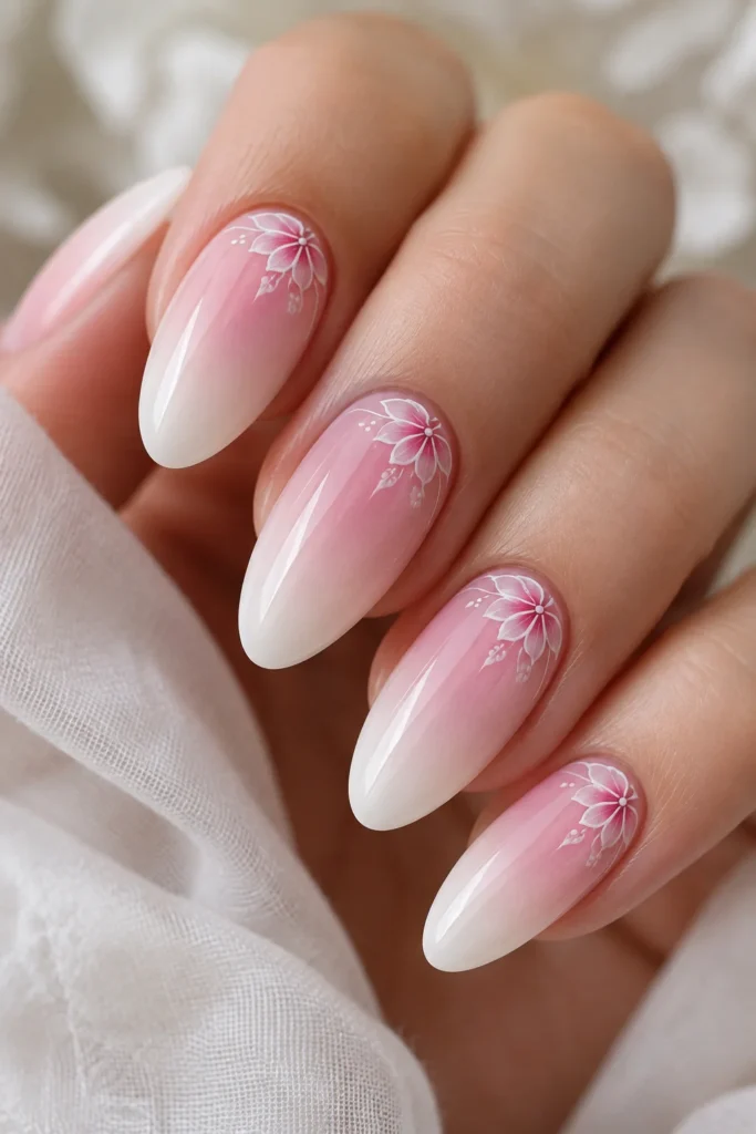
Thin, single-stroke florals painted right where the pink meets the white read as delicate instead of busy, because the flower sits in the densest part of the color transition rather than on top of the pale tip. This works because the eye naturally lands at the cuticle first, so a tiny bloom there feels intentional rather than crowded. Use a detail brush with thinned gel polish, not acrylic paint, so the line stays crisp against the blended base. One from-the-chair note: always let the ombre cure fully under the lamp before adding line work, or the brush drags white pigment into your petals and blurs the edges.
Chrome Cat-Eye Accent Nail

Instead of putting chrome on every nail, one cat-eye accent nail breaks up the softness of the fade without overwhelming it. The magnetic pigment needs a dark or medium base to show its shift, so this only works if that one nail’s gradient runs a shade deeper than the rest of the set. Placing it as the ring finger accent, the traditional spot for a statement nail, keeps the rest of the hand looking cohesive. Anyone comparing this to a classic manicure will notice it reads completely differently from standard french tip nail ideas, where the color block stays flat and matte by design.
Negative Space Cutout at the Fade Line

A small unpolished triangle or crescent right where the white starts to fade in lets the natural nail show through, which actually sharpens the gradient instead of interrupting it. This placement works because the ombre already softens gradually, so the eye reads the bare patch as part of the transition rather than a gap. It’s a technique that borrows heavily from basic ombre nail ideas, just with one extra step of masking before you spray or sponge the color. Keep the cutout small, no wider than a couple millimeters, or it starts to look like a chip instead of a design choice.
Rhinestone Trail Along the Cuticle

A curved line of tiny rhinestones, sized small to smaller, following the natural cuticle curve gives the fade a jeweled edge without covering the gradient itself. This sits right at the color transition because that’s the part of the nail with the most visual weight, so the stones catch light exactly where attention already goes. Set the stones before sealing with matte top coat, not after, since matte finish dulls the adhesive and makes gems pop off within days. This is one of those small technical calls that separates a set that photographs well from one that actually holds up.
Single 3D Floral on the Ring Finger
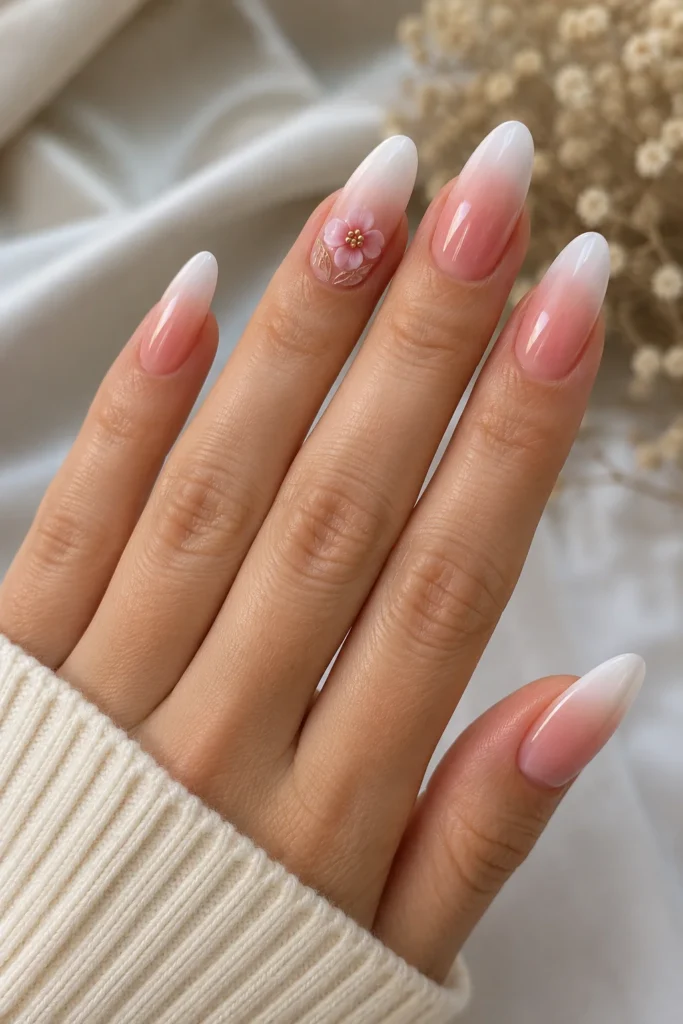
One raised acrylic or gel flower, built up in layers on the ring finger only, gives texture against an otherwise smooth fade. Keep it near the base of the nail rather than the tip, since the pale end of the ombre already draws the eye upward and a heavy design there competes with the fade instead of complementing it. This is a genuine trade-off worth mentioning upfront: 3D work adds bulk that snags more easily and shortens wear time compared to a flat design, so it suits someone getting fills every two to three weeks rather than someone who wants six weeks of wear.
Airbrushed Fade With Foil Flakes
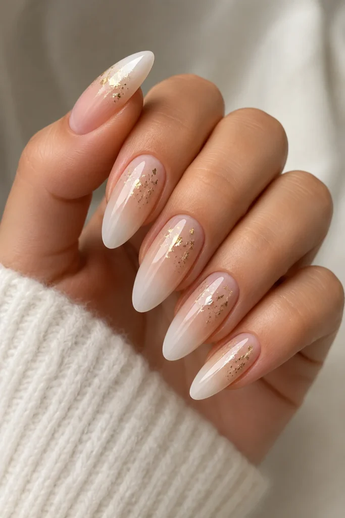
Airbrush application blends the white into the nude with almost no visible line, which gives fine top designs, like foil flakes or thread work, a much smoother surface to sit on than a sponge-applied gradient does. Sponge ombre tends to leave a slightly textured, mottled transition, and anything layered on top of that texture looks cluttered fast. Scatter gold or holographic foil flakes only in the upper third of the nail, near the white, so they catch light without breaking up the gradient’s center. This is a set best done in gel, since the layered top coat needed to lock in loose foil pairs naturally with the durability of a full gel nail ideas application.
Double Line French Hybrid

Instead of one soft white fade, add a second, thinner white line about a millimeter above the main gradient, creating a subtle double-edge effect. It works because it echoes the crisp line of a traditional French tip while keeping the blended softness underneath, giving you both looks in one nail. Precision here matters more than speed, so use a striping brush and steady hand rather than a stamping plate, which tends to smear on curved nail beds. This design shows its detail best on longer nails, where there’s enough surface for two distinct lines to read separately instead of blurring into one thick edge.
Marble Swirl Accent Nail

A loose, watery marble swirl in white, taupe, and a single vein of gold works as an accent nail because it mimics the same tonal palette as the ombre without duplicating the technique. Keep the swirl nail’s base fade lighter than the rest of the set so the marbling has room to stand out rather than blending into an already busy gradient. Marbling needs to happen while the base color is still wet, so this isn’t a design you add after the fact, it has to be planned into the application order from the start.
Abstract Hand-Painted Line Work

Thin, irregular black or dark brown lines swept diagonally across the upper half of the nail add movement without covering the fade’s softness. This design leans on negative space between the lines just as much as the ink itself, so resist the urge to fill in every gap. It reads best on almond nail ideas, where the tapered shape gives diagonal lines a natural direction to follow toward the tip. A common mistake here is starting the lines too close to the cuticle, which crowds the design into the deepest part of the color and makes the whole nail look busier than intended.
Pearl Chain Edge

A single row of micro pearls set along the smile line, right at the edge where the white curve begins, adds a bridal, polished detail without touching the rest of the nail. This placement respects the gradient because pearls sit exactly on the line the eye already follows, rather than competing with it from a random spot. Pearls are heavier than rhinestones and need a stronger gel bond, so this design calls for extra care during removal, soak-off rather than filing off, to avoid weakening the natural nail plate underneath.
Color-Block Tip Over Ombre

Painting a small solid block of color, a deep terracotta or emerald, just at the very tip over an otherwise neutral fade gives the design one bold focal point instead of scattering detail across the whole nail. This works because the ombre does the soft work underneath while the block does the statement work on top, and the two don’t fight because they occupy different zones of the nail. It’s a strong choice for coffin nail ideas, since the flat, wide tip gives a color block enough surface area to actually register as a shape rather than a smudge.
Matte-Glossy Contrast With Subtle Art

Leaving the ombre itself glossy while matting just a small painted design on top, a tiny star or dot cluster, creates contrast through finish instead of color. This only works in that order: gems and any glossy elements need to go down first, because matte top coat applied too early flattens the shine that makes rhinestones and foil sparkle in the first place. It’s a subtle effect, easy to miss in photos but noticeable in person, which makes it a good option for someone who wants detail without a loud design.
Choosing a Design for Your Nail Length and Shape
Delicate line work and single-stone placement read best on shorter nails, where there’s less surface area and a busy design gets cramped fast. Longer nails, especially coffin and almond shapes, can support bolder elements like 3D florals or two-line hybrids because there’s more room for the eye to travel across the design without it looking crowded. One more thing worth flagging before you sit down for a fill: if the ombre transition itself starts too high or too low on the nail bed, any design added on top will look off-center no matter how well it’s painted, so get the fade placement right first. When you book, just ask for “French ombre with design” by name and bring a reference photo. Most techs can build any of these once they know the base fade needs to come first.


